Assignment 5
Tackle as many of these problems as you can, submitting your answers along the way via this Google Form, which should autosave your answers. Be sure to click SUBMIT at the bottom of the Google Form when you have completed the assignment. You should receive an email receipt when the form has been properly submitted. You can resubmit, too, as many times as you’d like before the assignment’s deadline. Refer to these instructions for guidance on submitting.
To install this assignment’s dependencies (i.e., libraries), type
pip install matplotlib scipy
in VS Code’s terminal window.
Please be mindful of the course’s policy on academic honesty as you complete this assignment. When you engage with others regarding this assignment in peer learning sessions, be aware of our guidelines for assignment-related discussions. With the above in mind, the solution for the first item below denoted with an asterisk (*) may be openly discussed without restriction during peer learning sessions.
Not to worry if you run into trouble. Do just attend office hours for help! Further, consult our AI-based tool, cs50.ai.
Like last week, you’ll want to log into code.cs50.io using your GitHub account in order to use Visual Studio Code (VS Code) in the cloud. No need to install anything on your own computer. Keep in mind that you can create or open a file (e.g., hello.py) by typing
code hello.py
in VS Code’s terminal window. And you can run a progam (e.g., hello.py) by typing
python hello.py
in VS Code’s terminal window.
Question 1*
Plotting Simple Graphs
Consider the following graph that contains two lines regarding high and low temperatures in some fictional city:
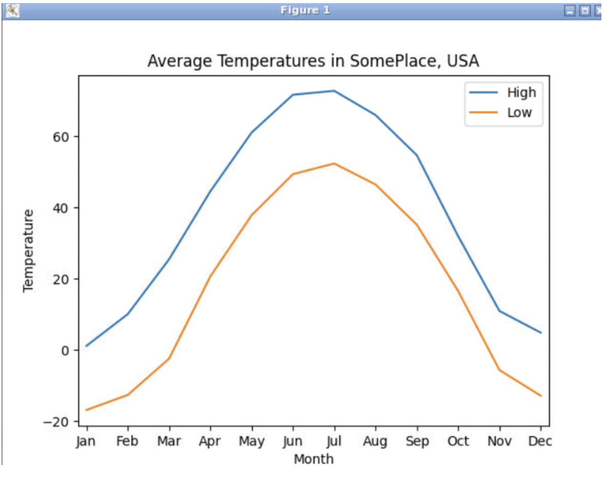
The data that was plotted comes from these two lists:
high_temps =  [1.1, 10.0, 25.4, 44.5, 61.0, 71.6, 72.7, 65.9, 54.6, 31.9, 10.9, 4.8]
low_temps = [-16.9, -12.7, -2.5, 20.6, 37.8, 49.3, 52.3, 46.4, 35.1, 16.5, -5.7, -12.9]
Write the Python code to produce the graph shown above.
Question 2
Space/Time Tradeoffs
Part 1
Suppose I have N items in my parts database, and they are sorted in the order that I happened to insert them. In other words, the items appear in no special order. If you wish to search for a particular item, say an item named “XXL widget”, on average how many different rows will you have to examine in order to find that item (assuming it’s in the database)?
Part 2
Suppose I have one million items in my parts database, and they are sorted in alphabetical order. If you wish to search for a particular item, say a person named “XXL widget”, what is the largest number of comparisons you would need to make if you utilize a binary search algorithm?
Part 3
You have seen examples of a tree structure and a hash table. Can you think of some operation that you can do easily in the tree structure that might be very difficult to do with the hash table?
Question 3
Monte Carlo
In probability theory, the birthday problem or birthday paradox concerns the probability that, in a set of n randomly chosen people, at least one pair of them will have the same birthday.
By the pigeonhole principle, the probability reaches 100% when the number of people reaches 367 (since there are only 366 possible birthdays, including February 29). However, 99.9% probability is reached with just 70 people, and 50% probability with 23 people. These conclusions are based on the assumption that each day of the year (excluding February 29) is equally probable for a birthday.
If there are 23 people in your HBAP cohort, what are the chances that at least two of you have the same birthday? Using Python’s random module, we can estimate this probability by generating random samples of 23 birthdays, and then checking for matches. In other words, writing a Monte-Carlo simulation.
Write a program named birthday.py that takes 2 command-line arguments: the number of simulations to run, and the number of students in the class. Note that you can use the function randint (from Python’s random library) to generate random birthdays as integers between 1 and 366.
The output from your program should resemble the following:
$ python birthday.py 900 23
After 900 simulations with 23 students
there were 458 simulations with at least one match of identical birthdays!

$ python birthday.py 900 23
After 900 simulations with 23 students
there were 451 simulations with at least one match of identical birthdays!

$ python birthday.py 900 45
After 900 simulations with 45 students
there were 853 simulations with at least one match of identical birthdays!
Question 4
Linear Regression
When you have two (or more) continuous variables, one can use “linear regression” to test whether there is a linear dependence between the variables. The ultimate goal of the regression algorithm is to plot a best-fit straight line (or curve) through or between the data. The data itself consists of one or more independent variables, along with a dependent variable.
As a source of data, we extracted statistical indicators for various industrialized countries from the OECD Factbook and converted it into CSV format. Each row lists the values for a particular country. Copy-and-paste the CSV data below and save it in a file named oecd.csv within your text editor.
Country,Per capita income,Life expectancy,% tertiary education,Health expenditures,Per capita GDP,GINI
Australia,43372,82.0,38.3,8.9,44407,0.33
Austria,43869,81.1,19.3,10.8,44141,0.27
Belgium,40949,80.5,34.6,10.5,40838,0.26
Canada,38241,81.0,51.3,11.2,41150,0.32
Chile,20472,78.3,28.8,7.5,21486,0.50
Czech Republic,25483,78.0,18.3,7.5,27522,0.26
Denmark,44079,79.9,33.7,10.9,42787,0.25
Estonia,23103,76.3,36.8,5.9,24260,0.32
Finland,39159,80.6,39.3,9.0,39207,0.26
France,37567,82.2,29.8,11.6,36933,0.30
Germany,42924,80.8,27.6,11.3,41923,0.29
Greece,25712,80.8,26.1,9.1,25586,0.34
Hungary,21419,75.0,21.1,7.9,22635,0.27
Iceland,34775,82.4,33.9,9.0,39097,0.24
Ireland,35767,80.6,37.7,8.9,43803,0.33
Israel,28430,81.8,46.4,7.7,29349,0.38
Italy,33920,82.7,14.9,9.2,34143,0.32
Japan,36752,82.7,46.4,9.6,35622,0.34
Korea,30178,81.1,40.4,7.4,30011,0.31
Luxembourg,60888,81.1,37.0,6.6,89417,0.27
Mexico,16875,74.2,17.3,6.2,17952,0.47
Netherlands,43757,81.3,32.1,11.9,43348,0.29
New Zealand,29872,81.2,39.3,10.3,32847,0.32
Norway,67440,81.4,38.1,9.3,66135,0.25
Poland,21826,76.9,23.7,6.9,22783,0.31
Portugal,25172,80.8,17.3,10.2,25802,0.34
Slovak Republic,25238,76.1,18.8,7.9,25848,0.26
Slovenia,28169,80.1,25.1,8.9,28482,0.25
Spain,32172,82.4,31.6,9.3,32551,0.34
Sweden,43967,81.9,35.2,9.5,42874,0.27
Switzerland,55465,82.8,35.2,11.0,53641,0.30
United Kingdom,35571,81.1,39.4,9.4,35671,0.34
United States,52547,78.7,42.4,17.7,51689,0.38
Let’s study the relationship between health expenditures and life expectancy. Does higher spending buy the citizens of a country a longer life?
We use a CSV reader to read the data, and append the values for the life expectancy and health expenditure columns to two lists:
lifeexp = []
healthex = []
reader = csv.DictReader(open('oecd.csv'))

for row in reader:
    lifeexp.append(float(row['Life expectancy']))
    healthex.append(float(row['Health expenditures']))
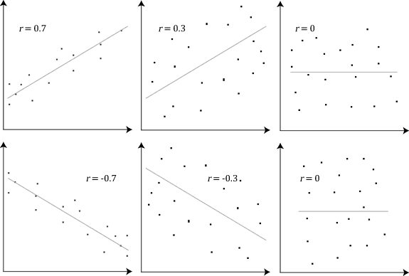
Now we can compute the linear correlation coefficient, a value between –1 and 1 that signifies how closely the data follow a linear relationship. A correlation close to +1 or –1 indicates that corresponding data points fall along a line. A correlation of 0 means that the points form a shape that is not at all linear. A correlation of 1.00 or -1.00 would mean all the data points lie on a straight line. See the following examples, taken from https://upload.wikimedia.org/wikipedia/commons/8/83/Pearson_Correlation_Coefficient_and_associated_scatterplots.png:
The function scipy.stats.linregress computes the linear correlation coefficient as well as the slope and x-intercept of the regression line – the line that best fits through the data points. The result is a tuple, and the slope, intercept, and correlation are its first three elements:
r = scipy.stats.linregress(healthex, lifeexp)
slope = r[0]
intercept = r[1]
correlation = r[2]
In our case, the correlation is 0.358864, which is quite weak. Let’s plot the data points and the regression line.
matplotlib.pyplot.scatter(healthex, lifeexp)
x1 = min(healthex)
y1 = intercept + slope * x1
x2 = max(healthex)
y2 = intercept + slope * x2
matplotlib.pyplot.plot([x1, x2], [y1, y2])
matplotlib.pyplot.savefig('output')
That last line of code (matplotlib.pyplot.savefig('output')) will save the figure in a file called output.png, which you can view by executing
$ code output.png
in your terminal window:
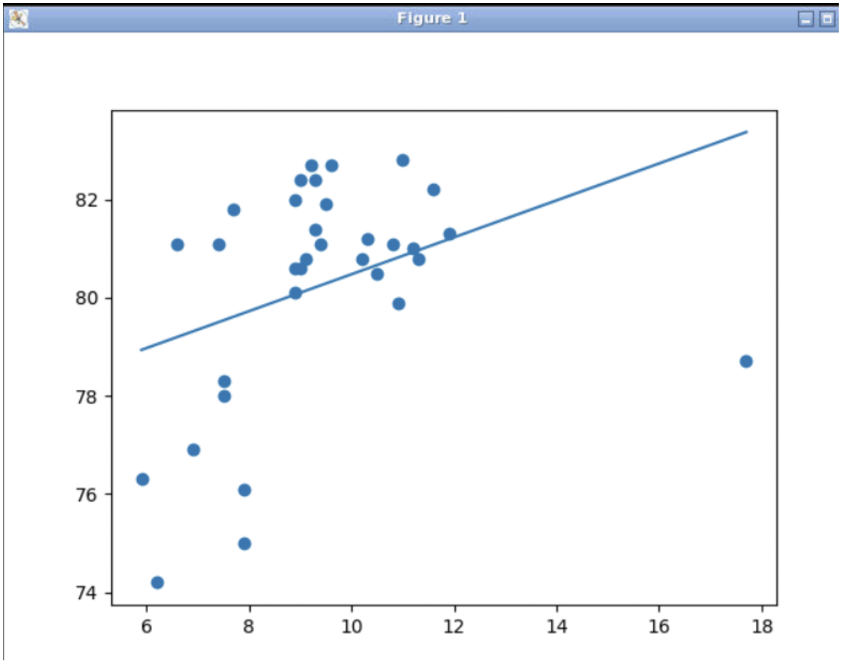
Well, it seems that there is one outlier, a country that spends far more than all others on healthcare without getting a commensurate return in terms of longevity. Yes, that would be the United States of America! Removing the outlying data point will yield a much better correlation.
Modify the oecd.py program to remove the data point for the United States. Draw the regression line and print the correlation.
For reference, below is the full oecd.py program, which you can copy-and-paste into your own file named oecd.py within your text editor:
import csv
import scipy.stats
import matplotlib.pyplot

lifeexp = []
healthex = []

reader = csv.DictReader(open('oecd.csv'))

for row in reader :
   lifeexp.append(float(row['Life expectancy']))
   healthex.append(float(row['Health expenditures']))

r = scipy.stats.linregress(healthex, lifeexp)
slope = r[0]
intercept = r[1]
correlation = r[2]
print('Correlation coefficient: %f' % correlation)

matplotlib.pyplot.scatter(healthex, lifeexp)

x1 = min(healthex)
y1 = intercept + slope * x1
x2 = max(healthex)
y2 = intercept + slope * x2
matplotlib.pyplot.plot([x1,x2], [y1,y2])
matplotlib.pyplot.savefig('output')
And for some optional “extra credit”: Use the OECD data set to determine the correlation between per capita income and life expectancy. Draw the regression line and print the correlation.
Question 5
Calgary Drop-In Centre
Skim the case study on the Calgary Drop-In Centre: Donor Information System. Make a list of the pros and cons for each of the 3 options.